Bridging the Photoshop divide
18th January 2016Photoshop isn’t up to laying out text for the web, so we made our own tool.
(This is cross-posted from the Friday blog.)
When designing digital products and services we know that the best results come when people work closely together. Especially designers and developers. However the tools for designing user interfaces don't always foster this collaboration. At best they allow designers to mock up small, testable prototypes; but at worst they encourage large canvas paintings of how an interface might look, with little regard for technical reality.
On a recent project for Nuffield Health we found one such example — the inconsistency of Photoshop's text rendering — that was stopping us designing the way wanted.
I’ll just say it: Photoshop is bad at laying out text for the web. It doesn't support the basics such as bullet lists or tables, nor does it have any concept of bounding boxes that browsers do, making translation into CSS rather tiresome. But even worse, we found that at key text sizes, Photoshop was inexplicably distorting glyphs within our client's brand font.
To some eyes, a squashed ascender here or inconsistent kerning there might be minor variations, but to our typophile designer Caroline, this was tantamount to sacrilege. As a result, she was forced to choose arbitrary text sizes that happened to yield un-broken characters in Photoshop rather than choosing the sizes she really wanted.
Sure, this isn't the end of the world, nobody's died. But it's an inconvenience caused by using inadequate tools. Furthermore, the problem is compounded by the fact that text is then rendered differently in various browsers: old Internet Explorers apply inconsistent antialiasing, Macs render more heavily than Windows, and retina devices sharper and thinner than lower resolutions.
These differences are normal and not something we should ever fight against, but it's evident that neither Photoshop nor Sketch are suitable for laying out web type. They are rough approximations.
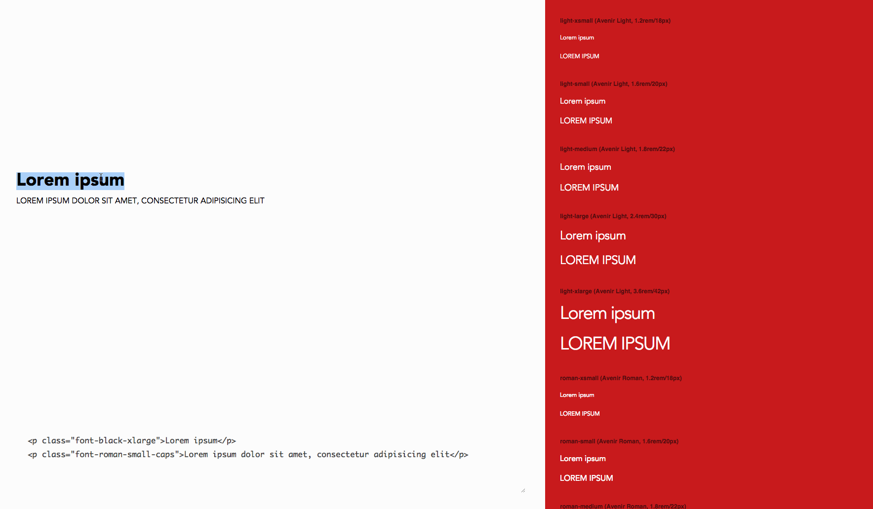
In an attempt to get around this problem I created a tiny tool, Taper, to allow Caroline to establish her typographic system in a browser as early as possible in the design process. Not designing in the browser, but deciding in the browser.
Taper allows a designer to edit a simple Sass file that represents a typographic hierarchy. One map for font families, another for sizes. From these, Taper will render a page that lets the designer paste in text and preview with family/size pairs.
There are so many benefits to this approach.
It provides an instant way of rendering text directly in the browser, warts and all. It's trivial to fire up Taper in IE8 to see what our unfortunate public-sector users will see, or on an iPad to see which combinations of styles pair well together at higher resolutions.
By defining styles using Sass maps, we emerge with a common language describing the design system. Instead of a frontend engineer rooting around in Photoshop layers hunting for specific text styles, the result are named styles such as "avenir-light-large" that make sense to designers, developers and brand owners alike.
Finally, by breaking away from traditional monolithic tools like Photoshop, simple tools like Taper encourage designers to scratch the surface of frontend development and coding. We copy the Sass maps from Taper directly into the production code where we're using the same mixins, thereby removing the need to translate design artefacts between people.
Getting the whole team closer to the medium of hypertext in a browser is key.
Give it a try on your next project and let me know how you get on.